Web Content
Redesign of credit union's mortgage web page
Challenge
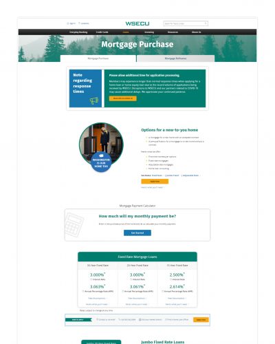
On this project, WSECU wanted to increase the proportion of mortgage lending requests for new mortgage loan applications. The organization also wanted to raise awareness of its mortgage loan products among existing credit union members, particularly first-time millennial homebuyers. In support of this effort, I was tasked with developing a content strategy for a web page redesign to update WSECU’s home loan product web page to help accomplish these goals.
Solution
In researching this audience, I distilled several key insights. For one, the process of getting a home loan could feel complicated, confusing, and overwhelming — even intimidating. So I knew I needed to find ways to significantly reduce cognitive load so that users would feel confident and reassured.
I started by thinking about the voice and tone of the page. The homebuying process can elicit a range of emotions — from frustration and confusion to excitement and pride — so establishing the right tone was crucial. It needed to be warm, encouraging, and supportive, with a consistent brand voice throughout.
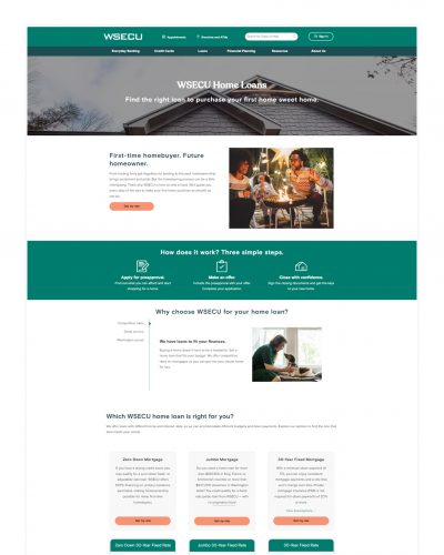
Looking at the existing page structure, the information wasn’t organized in a way that would enable users to easily intuit their next steps. It led in with jargon that many first-time homebuyers might not understand. I wanted the page to better align to the user’s journey, so I provided a new content outline. The updated page would:
- Open with a warm, welcoming introduction.
- Provide a simple, high-level overview of the application process.
- Introduce WSECU, its value propositions, and instill trust.
- Display and define all of the available product offerings.
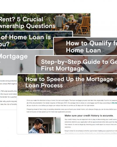
- And provide tools and resources to help the user.
Outcome
The updated web page, which was the primary access point for users to submit digital applications, was successful in helping the organization achieve its goals in conjunction with other marketing and operational activities.
Applications for new home loans increased by 27% over the previous year.
Of total applications received, first mortgages made up a 43% larger proportion compared to the previous year.
Among members surveyed, overall home loan product awareness increased 12%, while awareness among millennials increased 25%.
The average time on page was 91% higher than average.
The average click-through rate (CTR) was 97% higher than average.
The average number of pages per session was 42% higher than average.


